How we envisioned the world of Septima
2022. June 02.
Welcome to the fifth installment of the Design Spotlights series on Septima! Since today’s post is all about the evolution of the game’s art, Robin invited me to take the stage this week, and I was happy to oblige. 😊 I’m Villő Farkas, the artist of Septima, but you may also know my work from earlier Mindclash games, most notably Trickerion and Cerebria. I’m joined today by Barbara Bernáth, the character artist for Septima. Let’s get started!
If you read last week’s entry about the evolution of the theme and the first inspirations, you probably know just how much I loved this theme right from the beginning - actually, quite a bit more than that of any of our previous games!
I always start complex projects with the research work, and this time was no different. This usually starts with setting up an ever-expanding Pinterest mood board with illustrations and artwork of the theme, but I also watched several movies and read books not only to get inspired, but also to see different points of view on this delicate topic. I always try to absorb as much knowledge as I can to help me with the creative process - I’m at my best if I am constantly living with the topic and it fills all my thoughts.
On that foundation, I start building with the first sketches. Whenever I can, I draw by hand with pencil in my Moleskine booklet. The freedom of this analogue technique helps a lot in getting through the challenge of “starting from scratch”, and fits the design of a fundamentally analogue product quite well.
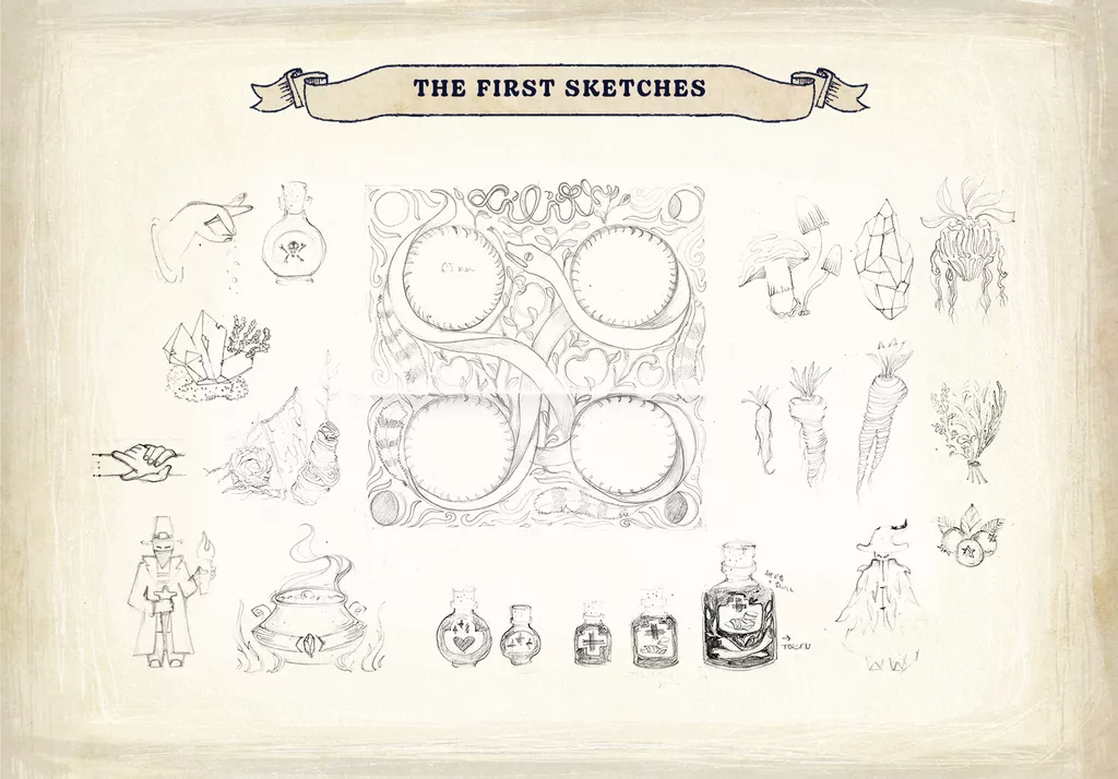
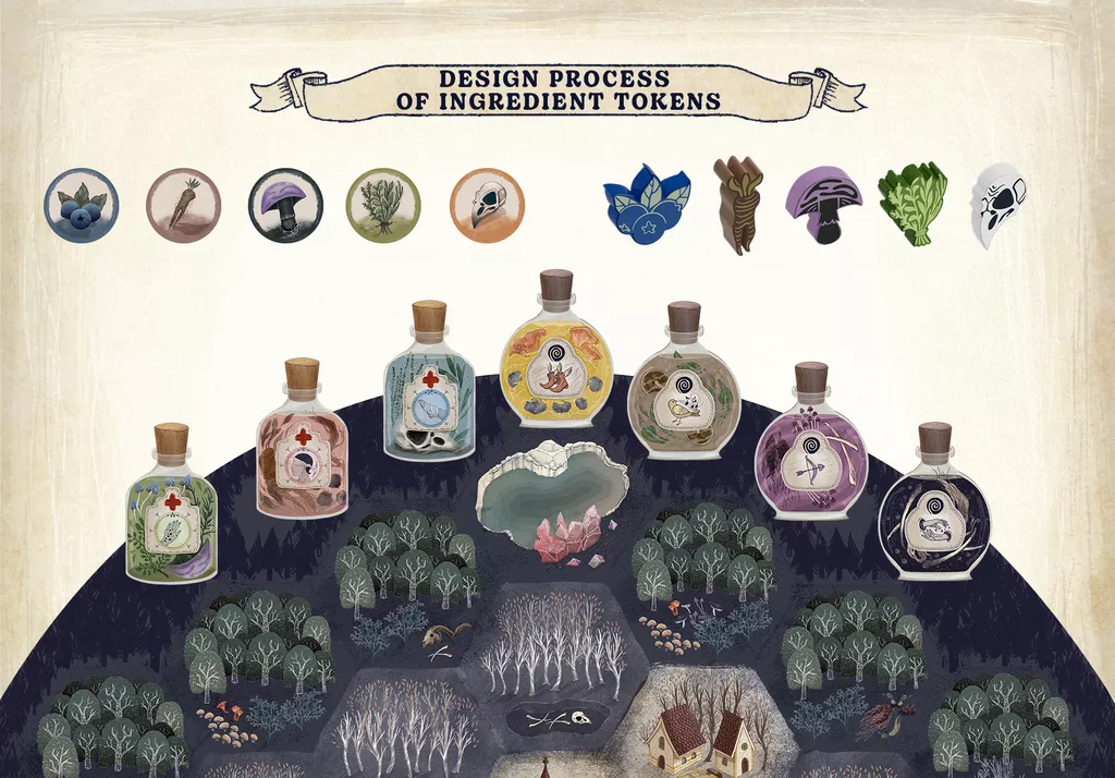
Generally, I like to start with some of the smaller game components rather than the “big picture”. It is quite important to try to figure out the individual components’ size before I start the design of game boards, because they have to look good but also fit the larger boards. In Septima, I chose the Ingredients to start with, because those also happened to be the most challenging designs. These special components must be as distinctive as they can, both as icons on printed materials, and as silk screened wooden pieces. The main goal during my planning process was to find different shapes and color schemes that are distinguishable, but at the same time fit very well into the game’s theme. They should be unique but universal at the same time.
Only five different types of Ingredients are used for brewing Potions in the game, but I wanted to widen the scope of the Ingredients in our world a bit. I used many different variations of mushrooms, herbs, bones, etc. on the Potion illustrations, as well as on the little details on the main board. With this, I wanted to emphasize the connection between witchcraft and nature in the world of Septima.
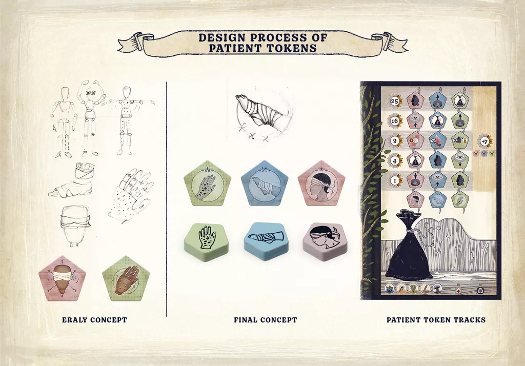
The other major challenge was creating the Patient tokens. I played around with lots of different ideas before arriving at the final one. I tried to avoid realistic depictions of sick people, so my first idea was a wooden doll concept. I highlighted the affected body part on the mannequin, but, especially with the infected (green) Patient, this approach proved to be a bit too abstract for the players.. Fortunately, the graphic style of the action cards was born at around the same time, so I started to use the same style here. The other thing that pushed me towards this solution was a game design change which created the Patient track mechanic (in previous iterations we collected the Patient tokens from the board). It meant that these illustrations had to work as Patient tracker tokens too: they need to be immediately recognizable, even if it means less details.
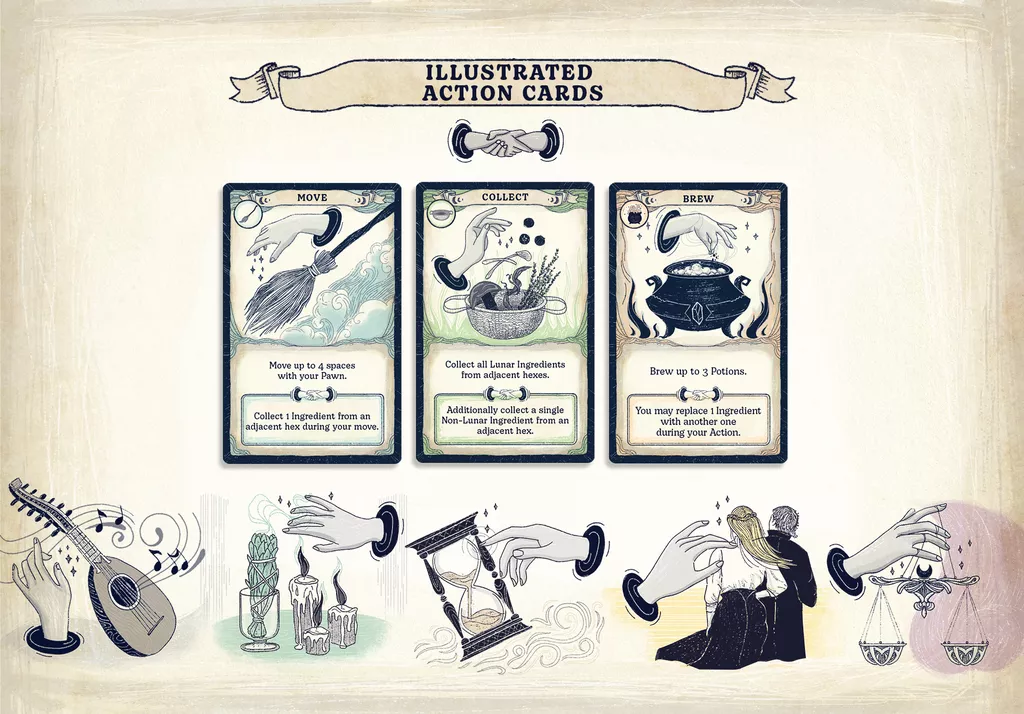
The third component design I would like to share with you is the idea behind the Action Cards. Card design is always a complex workflow, because usually the graphic design and illustration process go hand in hand along the way. My main challenge was how to describe actions like moving, brewing, collecting etc. using the same visual key. The solution I landed on was the human hand. I was able to describe each activity with different hand gestures and objects. The hand is a universal sign of ‘doing’ and at the same time the most important tool if you are a witch, because you conjure with it. Beside this, the visual key needs to connect to the main game design concept of Septima: when the players play the same action card, they can choose the bonus effect for both of their cards. And what is a better symbol for cooperation than a handshake?
Once I have a few smaller components figured out, that is when I usually start the box design. I have already created the main visual style, tackled some initial challenges, and the game design is almost ready, so I know exactly what the essence of the game is, both visually and mechanically. This is one of my favorite parts, but also the most difficult challenge in my work.
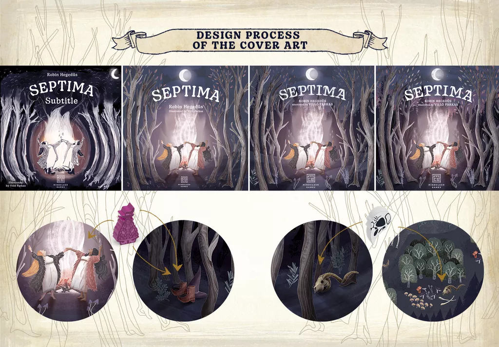
With Septima’s cover art, I wanted to capture the witch theme in a slightly different way, but without making it too unique to avoid misunderstanding it at first glance. I took my vision and then I mixed in the visuals of well-known witch symbols and elements from the Grimm tales and folklore. The impact of The VVitch movie is hard to deny, too. Universal visual cues such as women dancing around a magical fire help decode the theme immediately and make sure everybody knows this game is about witches. There are male witches in Septima too, but I realized if I change one of the female cover characters to male, it would probably be harder to recognize what the game is about.
For the in-game representation of the witches, I chose a more unique witch pawn design, because this was the best way I could explain the concept and connect it with the cover illustration. Both of the witches on the cover art wear fur coats and I drew a hat and boots hidden in between the trees on the side of the box too. In the forest art I used the same ingredients that the players can collect in the game, and this part of the forest also appears on the Main board, because it is important to connect the first impression on the cover with the world inside the box.
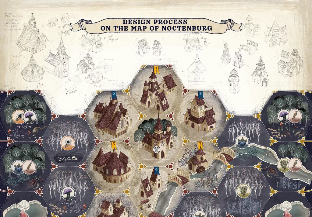
The last part of the creative process that I would like to share with you is the Main board design. The first step here is always setting up the framework that the game design requires - in other words, designing the UI. A good main board design supports the gameplay and helps players remember the rules, but at the same time immerses them into the theme through the artwork on it. Well, the problem is, these two criteria usually contradict each other, and at the beginning of the process I really struggled with finding the right balance. There are two main areas on the board: the town of Noctenburg and the surrounding forest where the Witch Pawns can move, and the Courthouse with Character tiles where the Trials take place. Both of these have different perspectives and dimensions and I wanted to separate them in an elegant way. I chose the round shape with a white stroke and bird's-eye view for the map section, and a closer side view for the rest of the main board.
If you put the main board and the box cover next to each other, you will see the night setting on both of them. There are two reasons for this. The first is because the night is magical and mystical, with the glowing moon and mysterious shadows and creatures. This visual style expresses that the game is more serious than a fairy tale for children. The other reason is that I wanted to avoid using warm colors around the witch tiles. This is a fictional world, and, as Robin mentioned in our previous Designer Spotlight, witches are exiled from Noctenburg if they lose the Trial, so I wanted to avoid any associations between warm colors and bonfires.
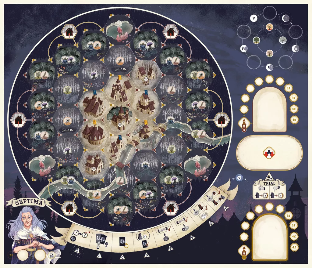
Before I started the actual work on the map illustration, I had drawn a lot of buildings from an almost isometric angle. I prefer this viewpoint over a top-down/bird’s eye view because more details can be shown this way. The visual style of the buildings is a mix of Dutch architecture and a small mountain village building style, giving Noctenburg a more “magical” feel than an actual European medieval town. I purposely chose warmer, lighter colors for the city, and cooler, darker ones for the forest to express that being in the forest is much more dangerous. The forest illustration itself was challenging but a lot of fun - the background of each hex actually supports the Ingredient icon(s) on it, giving the forest a unified look that’s actually very diverse and unique in its small details!
In summary, I am having a blast working on this project. Being responsible for both the UI and most of the illustrations was a major challenge, but this way I could create a cohesive visual world that is truly my own.
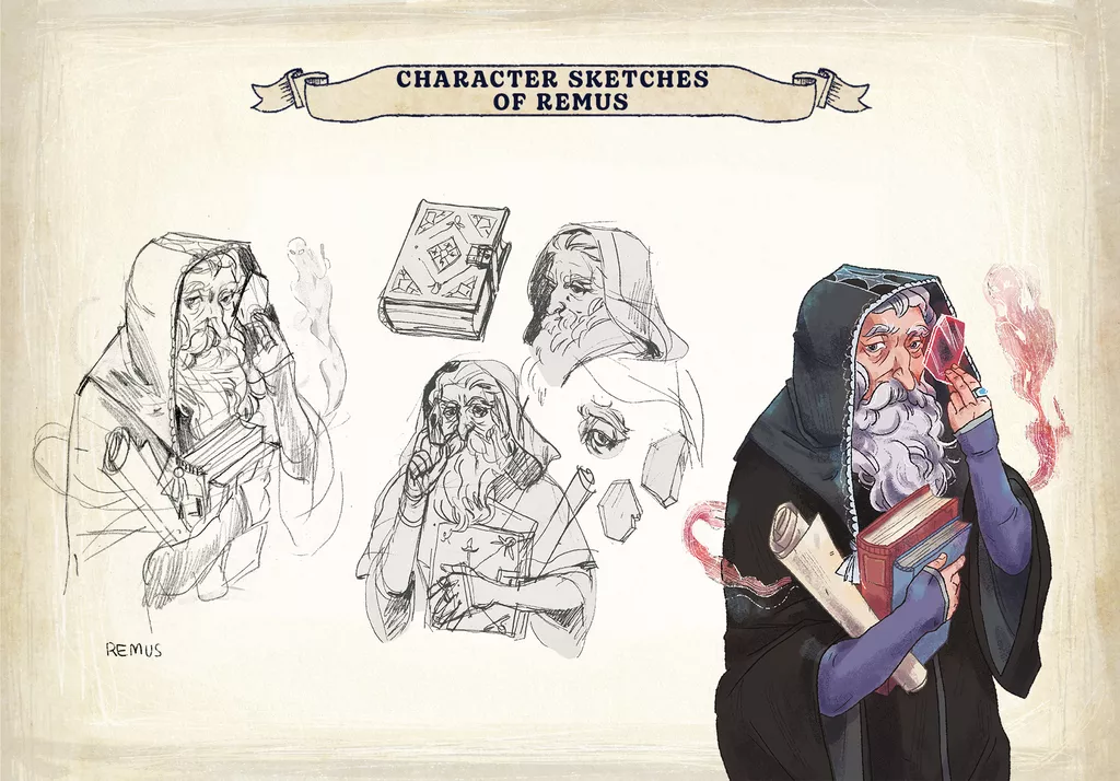
The one part of the illustration I had some amazing help with was the character art, so before I say goodbye, I would like to give the word to Barbara Bernát, the character illustrator of Septima! She is a new collaborator with Mindclash Games, but we had the chemistry right from the very first time we sat down to play Septima together!
I am an illustrator and graphic designer. I love playing games, especially fantasy and sci-fi, retro-style computer games, but board games are also close to my heart. I haven't had the opportunity to work on games of this complexity so far, but I have designed a few smaller ones for a Hungarian publishing house, where I have also illustrated many children's books and young adult novels, some of which are also set in fantasy worlds. Designing characters is always one of the most interesting tasks in books too, so I was very happy to have the exciting opportunity at Septima, it felt quite a challenging task.
When I design a character, the most important thing for me is that their personality comes through in the drawing, so I usually draw inspiration from many sources, creating a mix of familiar characters, actors and characters in my head. The detailed backstory written by Robin for the witches is what helped me embody them the most. I have a separate Pinterest board for each of them where I've collected inspiration both in terms of looks and clothing. I like to make subtle references to the characters' past with accessories or clothing, because that's what makes them really unique. We adapted the style to Villő's drawings, which was also an exciting challenge - luckily our approaches are close as we went to the same university in Sopron.
Thanks for reading - I hope you enjoyed this little behind-the-scenes tour of creating the visual world of Septima. Next week, Robin will be back to conclude the Designer Spotlight series with a look at the different game modules and additions to the game’s core system.
See you there,
Villő
If you would like to get notified once Septima launches, subscribe on Kickstarter using this link.