Evolution of the Visual Concept
February 26, 2020
Perseverance vol.2

I am Richard Amann, Co-Founder and Creative Director of Mindclash Games. In our team, I’m the “Theme Guy” and as such, I’m responsible for our games’ thematic and visual coherence. While I’m also involved in game design with my business partner Viktor Peter, the most important part of my job is leading the art department, a field in which I proudly collaborate with our art director and graphic designer, Villő Farkas. You’re already familiar with her fantastic work if you’ve played at least one of our games. Her attention to detail and fine sense of aesthetics makes her the perfect person to turn to whenever I’m in doubt with a certain visual concept.
Today I’m here to tell you the story of how the world of Perseverance was born.
If you are not familiar with the concept, imagine that the luxury ocean liner you are spending your well deserved holiday on gets caught in a horrible storm. You survive, but you end up stranded on a mysterious island inhabited by dinosaurs and soon you discover signs of a lost civilization that was seemingly able to ride these dangerous beasts… Now imagine a society forming in this hostile but fascinating environment which you are part of, in fact, you are one of its leaders. This is Perseverance.
It all goes back to the beginning of 2017, when the creative concept for this game was already given the green light (to my greatest joy as this was a dream coming true for me) and I was trying to recruit Lacza Fejes, the lead illustrator of Anachrony for the job. He was preoccupied with a videogame project (so were we with Cerebria), but every now and then, we sat down for a coffee and talked about how we imagined this unique world. I loved these little brainstorming sessions of ours, as this ambitious vision was slowly taking shape – or at least I thought so.
Early Fall 2017 Lacza joined us to work on Perseverance, and we started to experiment with the visual style. The first milestone we had to hit was presenting the game at Essen Spiel 2017.
Below is how this presentation turned out:
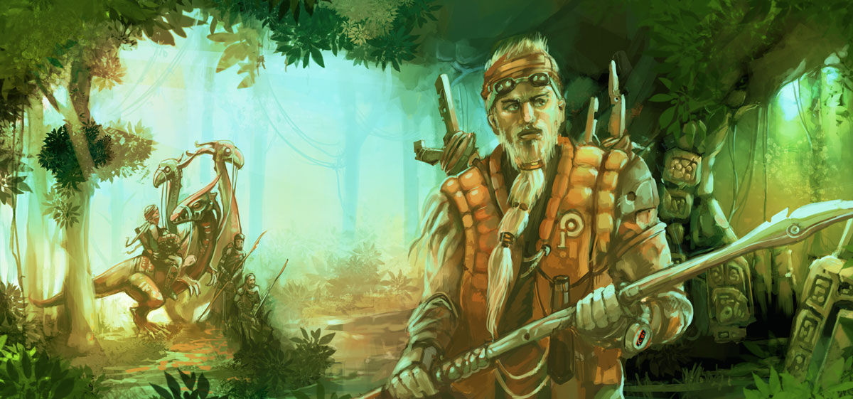
This was still an early visualization of the creative concept (born approximately a year after we came up with the idea of the dinosaur island) but we were happy to have at least one illustration on our hands, the first artwork that represented the four episodes of this ambitious project. Well, represented Episode 3 to be accurate, since back then we hadn’t even played with the idea of an episodic approach.
Soon it turned out that this dinosaur world was not a great fit for Lacza, he was much more into Transhumanity (remember the mind-blowing cover art concept for Transhumanity? That’s his work too) but that was still quite far away down the road for us, so we decided to go our separate ways. Although we saw potential in this visual style, changing the lead artist often means changing the style, so that’s what followed.
It was early 2018 when I brought in Marton Kiss, another artist I’ve been working with on Anachrony’s illustrations. Together we started building an art team for this project reaching out to Tamas Baranya (Trickerion – Academy) and Laszlo Szabados (Anachrony). While the game design team was still working on Episode 3 to match the new theme, we started working on the new visual concept of the game world, touching only the parts which were not affected by the game design choices, such as the ship, the dinosaurs, the vegetation, the ancient civilization, architecture and graphic design of the game, like the logo itself.
It was groping in the dark all over again, looking for the visual style, the color palette and mood of this fantasy world, the right mixture of modern and island resources in the character design and architecture. I could go on for a while about how many questions we still needed to find an answer to, for a game that was not even finished at the time, but I would rather show you where all that path-searching has lead us for Gen Con 2018, our second major milestone:
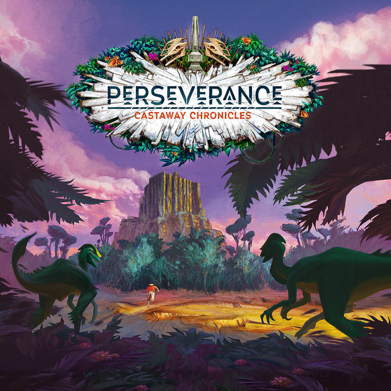
You are probably familiar with this image as this has been the cover art of the BGG page ever since. But I’m probably not spoiling anything when I say this image still does not represent the final visual style of the game…
In Fall 2018 the art team had split up once again, with two of the artists having other priorities in their life, but fortunately we still had Tamas Baranya with us. We were happy about the overall mood and feel of the illustration above, but the visual style was mostly reflecting Marton Kiss’s work, and we wanted to experiment with something less conventional. We kept working on the style with Tamas Baranya along with the visual representation of the world for another 3-4 months until we arrived at our next major milestone, the piece I finally felt fit the vision I had about this world:
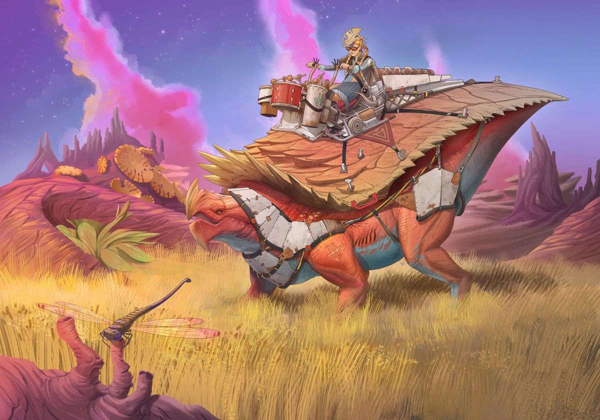
The amount of work we put into this image might not be obvious at first glance, but if you think about it, there isn’t a single element on the picture that did not have to be designed from scratch. Not to mention how far there is to go as we know so much more about this world now than we did a year ago.
We had a vision of a world that’s constantly evolving and changing throughout four games, so that’s what we started working on after we had arrived at this image, which was still only representing Episode 3.
It was obvious that Tamas will not handle all the necessary art for this epic project alone. Luckily for us, two very talented illustrators joined us for the Anachrony – Infinity project, and they were happy to continue on to Perseverance once they finished their work on Anachrony. Csilla Kiskartali joined the team to work on the architecture design which was needed to fill the main board and player board with life, while István Dányi joined the project to work on the character art.
In the Summer of 2019 we finally had a visual style, a clear vision of where we are headed at least until Episode 3, a powerful art team, and tons of concepts that were mostly useless (but hey, at least we knew what we didn’t want to do!) All the struggles of finding the right people and the right visual world finally paid off. On another track the game design team (including me) worked hard on finishing Episode 1 so we could present it to the public at Essen Spiel 2019.
As a culmination of all the hard work, this image was born to represent Perseverance, more precisely Episode 1, at Spiel 2019:
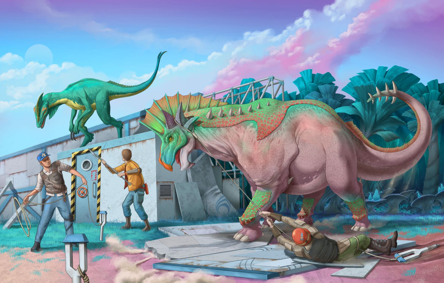
Since then, we have been focusing on Episode 2 so we can present it to you in its full glory when we reach our next major milestone, probably the most important so far, the Kickstarter campaign for Perseverance Episode 1 and 2.
I hope you enjoyed my memoir about the visual world of this project so far. In my next post I will be leading you behind the curtains and show you more about how the different concepts have evolved throughout time.
As a farewell and teaser until next time, here is the evolution of the Light Soldier with the final version for Episode 1:
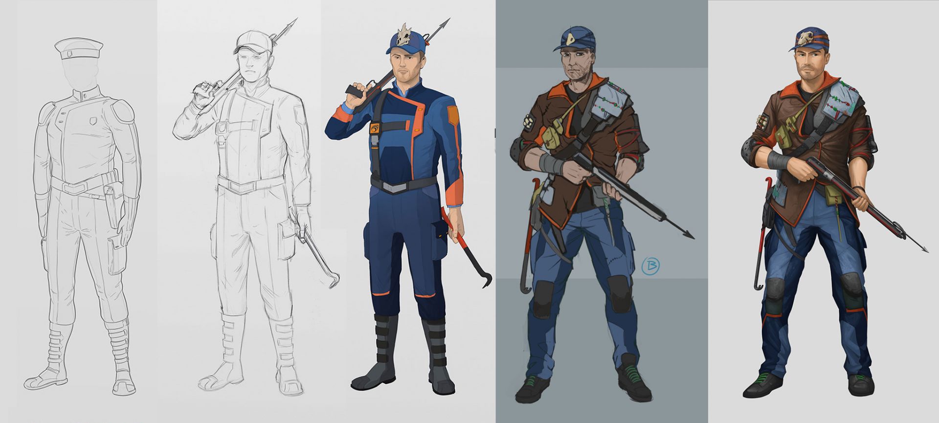
Take care, and beware of loose dinosaurs,
Richard